Here are a few tips and tricks I’ve picked up over the years that will help you create interesting and performant animations & transitions for your next project.
Tip #1 – Some properties are more taxing than others
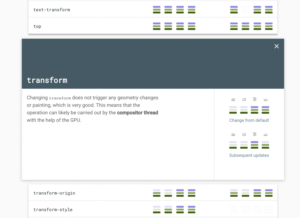
The most common cause of laggy animations on the web comes down to this. Generally, most properties go through all three stages of rendering; layout, paint and composite. This takes away precious processing power and can lead to things like laggy scrolling. You can check out which properties are the most taxing and why at https://csstriggers.com/.
A decent workaround
Generally, you want to limit animations and transitions to only ever use transform and opacity when possible. This strips away the need for the browser to go through the layout and paint phases, making the animations appear smoother for the less powerful devices.
Instead of animating the taxing properties directly, place them on a psuedo element and animate that psuedo element using
opacityortransform
Below is an example where box-shadow is animated using opacity on a psuedo-element, instead of animating the box-shadow property directly:
/* Animating box-shadow without transitioning box-shadow property */
.box{
  width:500px;
  height:500px;
  background:hotpink;

  position:relative;
}
.box::after{
  /* Position element below  */
  content:"";
  position:absolute;
  z-index:-1;
  top:0; left:0; right:0; bottom: 0;
  pointer-events:none;

  /* Apply box-shadow and hide initially */
  box-shadow:0px 0px 10px -5px #000;
  opacity:0;
  transition:opacity .2s;
}
.box:hover::after{
  /* Transition and show box-shadow on hover */
  opacity:1;
}
Tip #2 – Animating borders
Using the same technique as above, we can easily animate borders using scaleX and scaleY
/* Animating borders using psuedo-element */
.box{
  width:500px;
  height:500px;
  background:hotpink;

  position:relative;
}
.box::after{
  --borderWidth: 2px;
  /* Position element below  */
  content:"";
  position:absolute;
  z-index:-1;
  top:calc(var(--borderWidth) * -1); /* Minus border width */
  bottom:calc(var(--borderWidth) * -1); /* Minus border width */
  left:0; right:0;
  pointer-events:none;

  /* Apply borders */
  border-top: var(--borderWidth) solid #000;
  border-bottom: var(--borderWidth) solid #000;
  /* Initially shrink horizontally */
  transform: scaleX(0);
  transition: transform .2s;
}
.box:hover::after{
  /* Transition and expand border on hover */
  transform: scaleX(1);
}
Tip #3 – Use animation-fill-mode
Let’s say you want to fade something in, but you want there to be a delay before the fadein occurs.
If you try just adding animation-delay, the element would show until the delay is over and then abruptly disappear then fade in again, as seen here:
How do we prevent this from happening?
One method, which a lot of people immediately reach for, would be creating some unnecessarily complicated keyframes to keep it hidden until a certain percentage and playing around with animation-duration.
A far better method is to use animation-fill-mode.
By setting animation-fill-mode: backwards; we are essentially telling the browser:
” Hey, for the duration of the animation-delay, keep the CSS from the first relevant keyframe active. “
The first relevant keyframe in this context just means the first keyframe that is played in the animation, which depends on the animation-direction property.
You could also set animation-fill-mode to both, then it would also retain not only the CSS from the first keyframe, but also the CSS from the last keyframe after the animation has finished.
In our example, that would mean keeping the opacity during the pre-delay, as well as the pink background after the animation is complete:
Tip #4 – Stagger animations using CSS variables
It’s fair to assume that most of the time when dealing with lists of items on modern websites, they are rendered using some sort of Javascript loop.
By grabbing the index in the loop and applying it as a CSS variable to the element, we can then this index to calculate animation-delay to get a nice and clean stagger effect.
Here’s an example using plain old vanilla js:
const listItems = document.querySelectorAll("ul li");
listItems.forEach((item, index) => {
   item.style.setProperty("--i", index);
});
Now in our CSS, let’s apply the animation-delay:
@keyframes fadeIn {
  from{
    opacity: 0;
  }
}

li{
  animation: fadeIn .2s ease-in-out;
  animation-fill-mode: backwards;
  animation-delay: calc(var(--i) * 0.1s);
}